How I built that: Layouts for Ghost
How can you build interesting page layouts in the Ghost editor? Several options!
I get a lot of requests to set up Ghost landing pages. Here are some options for making layouts that aren't just a column of text.
Option #1: Use what's available natively in Ghost
Making interesting layouts has gotten easier with the new header cards. The "card" below is native Ghost, no changes or extra CSS.

Hello! Do you love this card?
Sign upAnother 'header' card option:
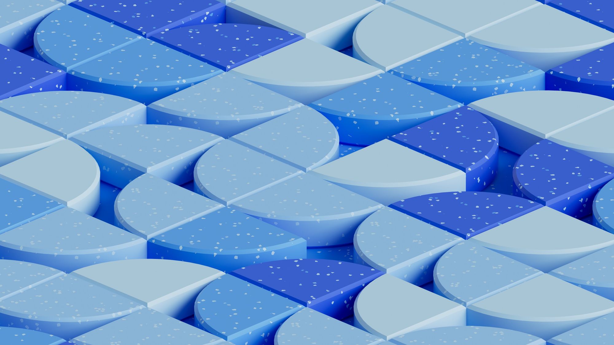
Ghost is pretty awesome and you should try it out
This is a standard header card set to full width.
You can put a fair amount of text in the subheading section, but long titles definitely start to look sort of strange.
(Image credit: Photo by ilgmyzin on Unsplash)
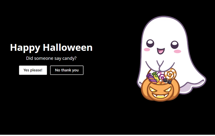
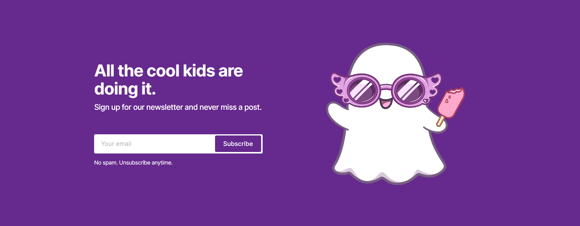
The sign-up card below looks great, but it doesn't show up in email or for subscribed members, so plan carefully if it's a key part of your layout. In this post/newsletter, I'm actually adding it as an image (which means it's going to look wrong on phones, sorry), so that it'll show up everywhere.
Option #2: Repurpose Ghost elements
Part 1: Fun with product cards
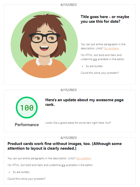
I've had lots of requests for layouts with three-wide cards. Cards are a super common layout, but Ghost only really does them natively for posts. But fear not, the product card is here to help you solve your problem!
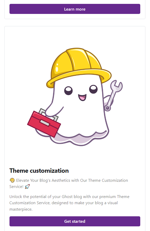
If you use cards without modification, you're going to get something like this:
But we can achieve the layout below instead! Now product cards pack three-across, like many of my customers have asked.
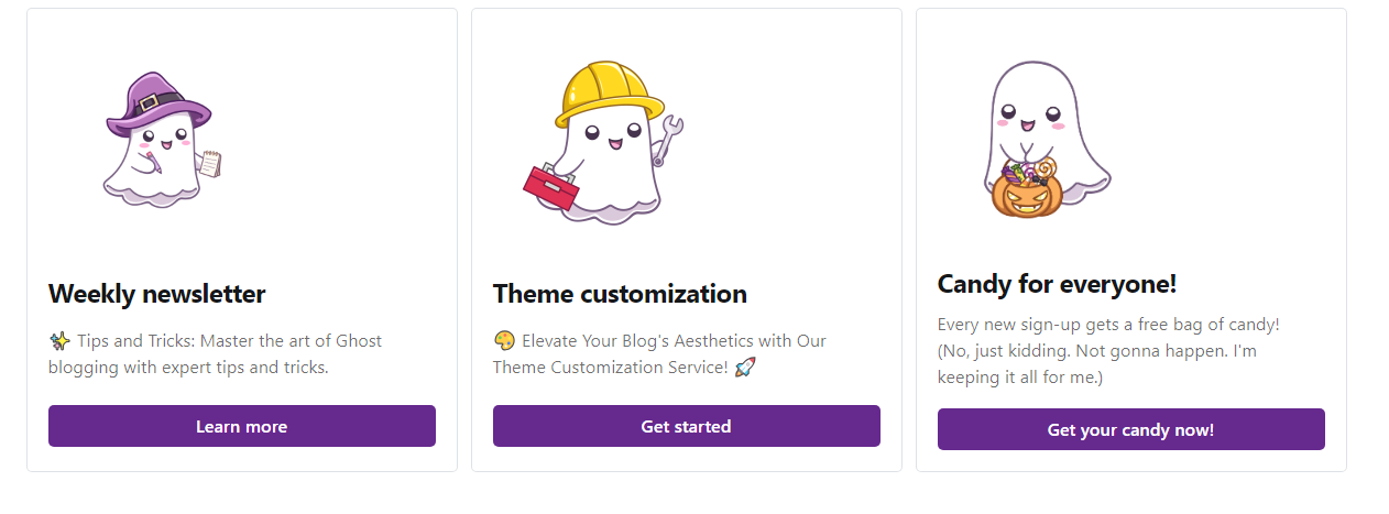
How'd we do that? Two tricks:
"Wrap" the product cards in a custom container, using HTML cards.
above the product cards:
<div class="three-box">

below:
</div>
Add some extra styling.
<style>
  .three-box {
    grid-column: wide-start/wide-end;
    display: grid;
    grid-template-columns: 1fr 1fr 1fr;
    gap: 12px;
  }
  @media screen and (max-width:767px) {
    .three-box {
       grid-template-columns: 1fr; }
  }

  .three-box .kg-product-card-container {
    height: 100%
  }
</style>
And that's it! Put the first two little HTML cards in as snippets, and drop the styles into code injection (or your theme), and you're ready to have three-wide cards anywhere!
Once you've got the .three-box selector as a handle, you could add additional restyling to the product cards, too!
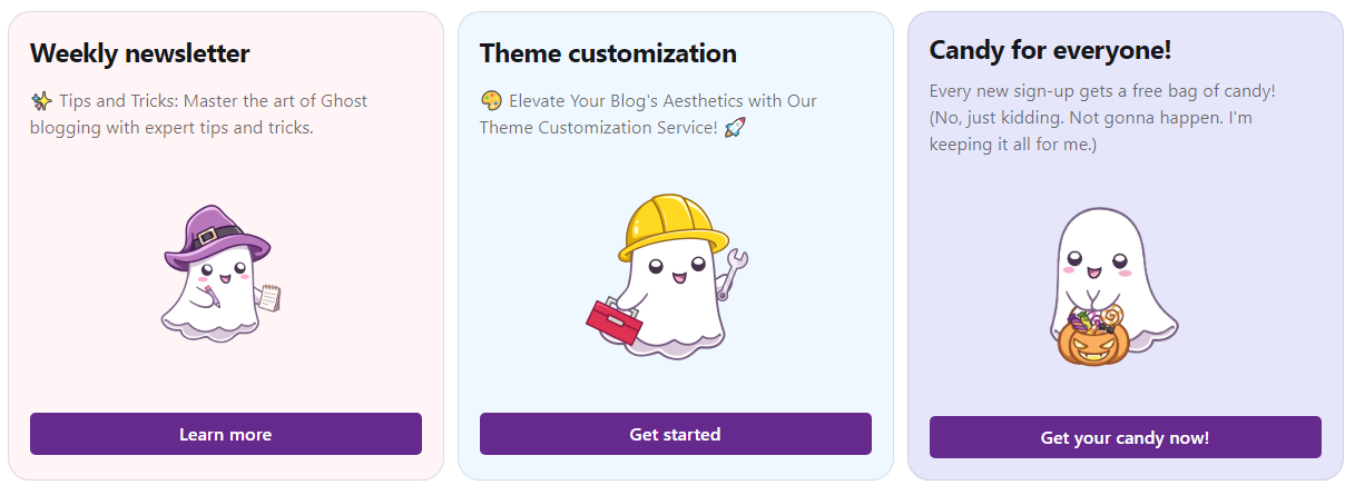
For additional examples of rearranging the product card sections (and even tricking it into containing MORE sections), see this post:
Part 2: Fun with buttons
Another common request is buttons on a row. Here's an example:
<!-- in code injection or added to the theme -->
<style>
  .button-holder {
    display:flex;
    align-items: flex-start;
  }
  .button-holder .kg-button-card {width: unset; padding-right: 16px}
</style>

And then wrap the button group with HTML cards containing:
<div class="button-holder">

and

</div>
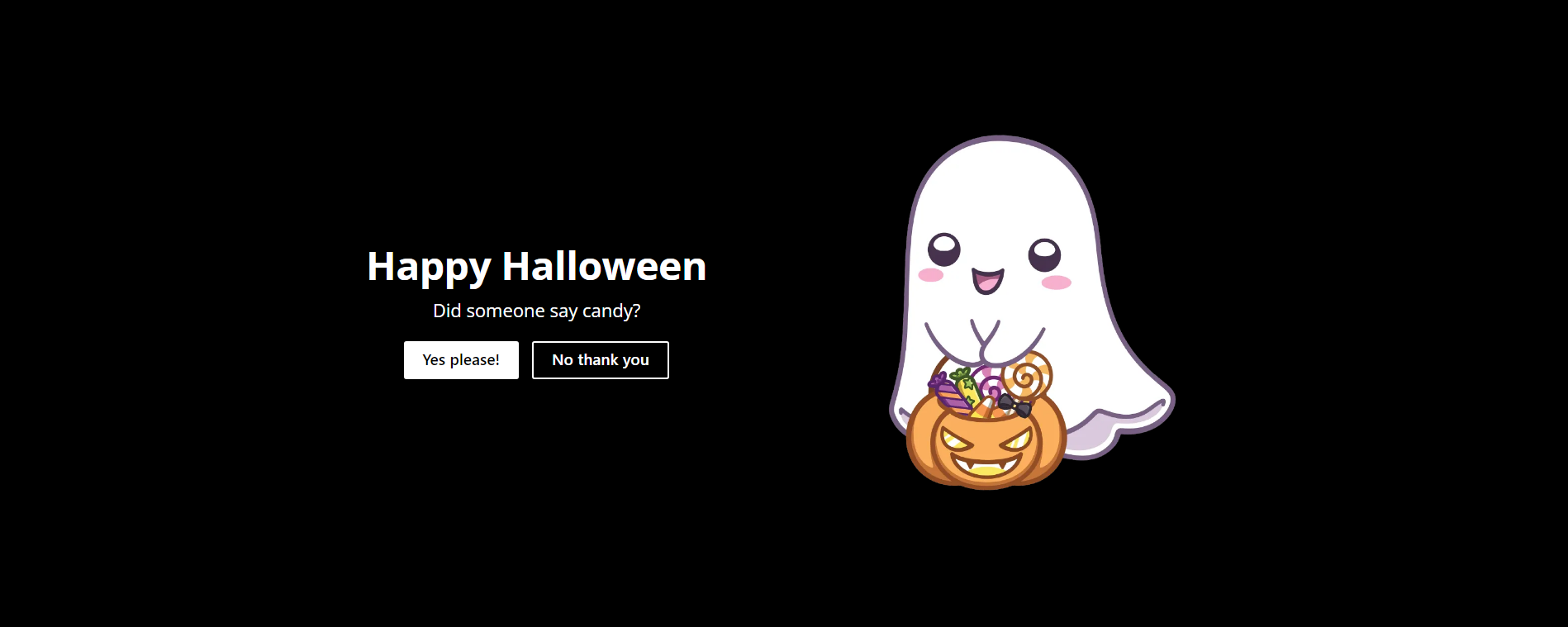
OK, great, but what if you want two buttons in a header card?
Note to email viewers and newsletter senders: Because this requires some javascript, it will not work correctly in email. If you really need this layout in an email newsletter, it would need to be scratch-built as an HTML card.

Here's how I do it:
<script>
  let buttonHolder = document.createElement('div')
  buttonHolder.classList.add('button-container')
  let cardText = document.querySelector('.kg-header-card + .kg-button-card').previousElementSibling.querySelector('.kg-header-card-text')
  let firstButton = cardText.querySelector('a')
  let secondButton = document.querySelector('.kg-header-card + .kg-button-card > a')

  cardText.appendChild(buttonHolder)
  buttonHolder.appendChild(firstButton)
  buttonHolder.appendChild(secondButton)
  secondButton.classList.add('kg-header-card-button')

</script>

<style>
  .button-container {
    display: flex;
    margin-top: 16px;
  }
  .button-container a {
    margin: 8px;
  }
  .button-container a:nth-child(2) {
    background-color: transparent;
    border: 2px solid currentColor !important;
    color: white!important; /*needs improvement for other header colors*/
  }
</style>
And here's a snapshot of the result (in the browser):
More ideas:
I've also used this trick of wrapping editor content with html content to create side-by-side sections and sections with backgrounds. You can see several examples in use below:

The general approach is similar. Wrap the content to be grouped in an outer div, wrap the content on the left side and right sides in separate divs, and then get them side by side for wide screens using some CSS. The result is a page built in the Ghost editor and fairly user-editable, while still creating layouts that match what the designer wanted.
Hey, before you go... If your finances allow you to keep this tea-drinking ghost and the freelancer behind her supplied with our hot beverage of choice, we'd both appreciate it!

Addendum - live product cards

A block of text here is the title
The description goes here!
It can be multiple paragraphs if desired.
- Bullets are cool, too
- So are links.

A block of text here is the title
The description goes here!
It can be multiple paragraphs if desired.
- Bullets are cool, too
- So are links.

A block of text here is the title
The description goes here!
It can be multiple paragraphs if desired.
- Bullets are cool, too
- So are links.
